In this post, we’re going to give you seven tips that will help you to design compelling virtual presentation slides.
More specifically, here are some of the main tips we’re going to discuss:
- Choose the right presentation theme
- Use the right color combination
- Use a modern presentation tool
- Keep it simple
- Maintain a brand identity
- Tell stories with data visualizations
Let’s get right into it.
Table of Contents
Tip #1: Choose the Right Presentation Theme
Tip #2: Use the Right Colors
Tip #3: Use a Modern Presentation Tool
Tip #4: Make Use of White Space
Tip #5: Keep It Simple
Tip #6: Maintain a Brand Identity
Tip #7: Tell Stories With Data
Tip #1: Choose the Right Presentation Theme
The first tip we have for you – one of the most important tips when creating a virtual presentation – is to choose the right presentation theme.
The right presentation theme is the one that’ll not only catch the audience’s attention but will also help you structure your presentation in an interesting and efficient way. as well as help you incorporate elements of your brand identity.
Finding the right presentation theme means that the tone and atmosphere your slides are creating match the messaging you’re trying to communicate through your presentation.
What does that mean?
Let’s look at an example of a customizable presentation template:
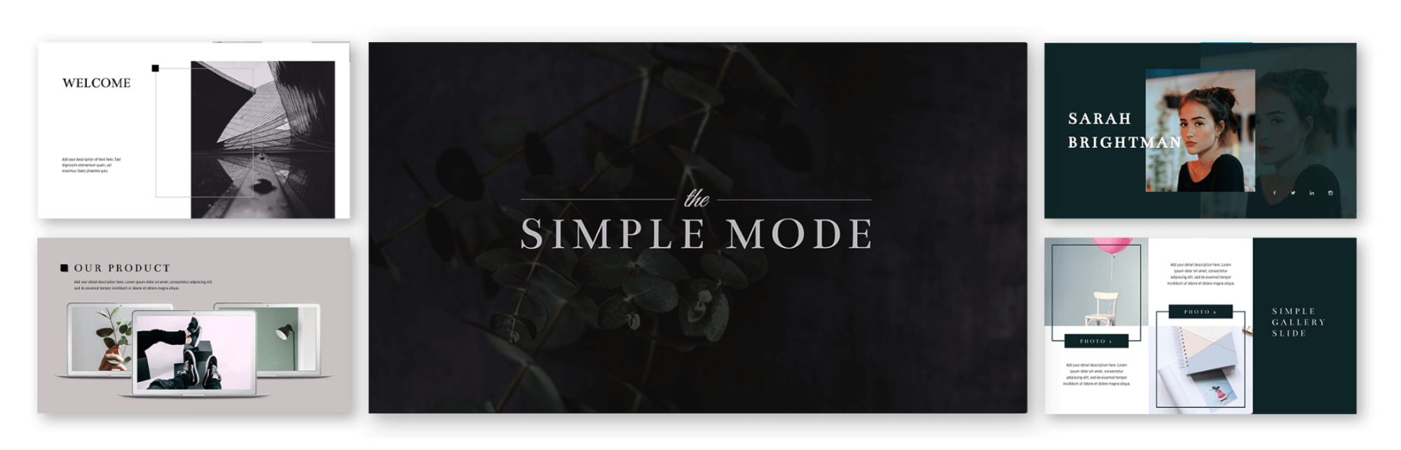
The template is minimal and focuses on presenting a clear message by providing the audience with clean-cut images and graphics.
Such an approach allows the audience to follow the presenter’s flow and thoughts.
Templates like the one shown here could be used for a variety of reasons, such as presenting the characteristics of a new product from a company that’s known for their minimalistic and modern design approach.
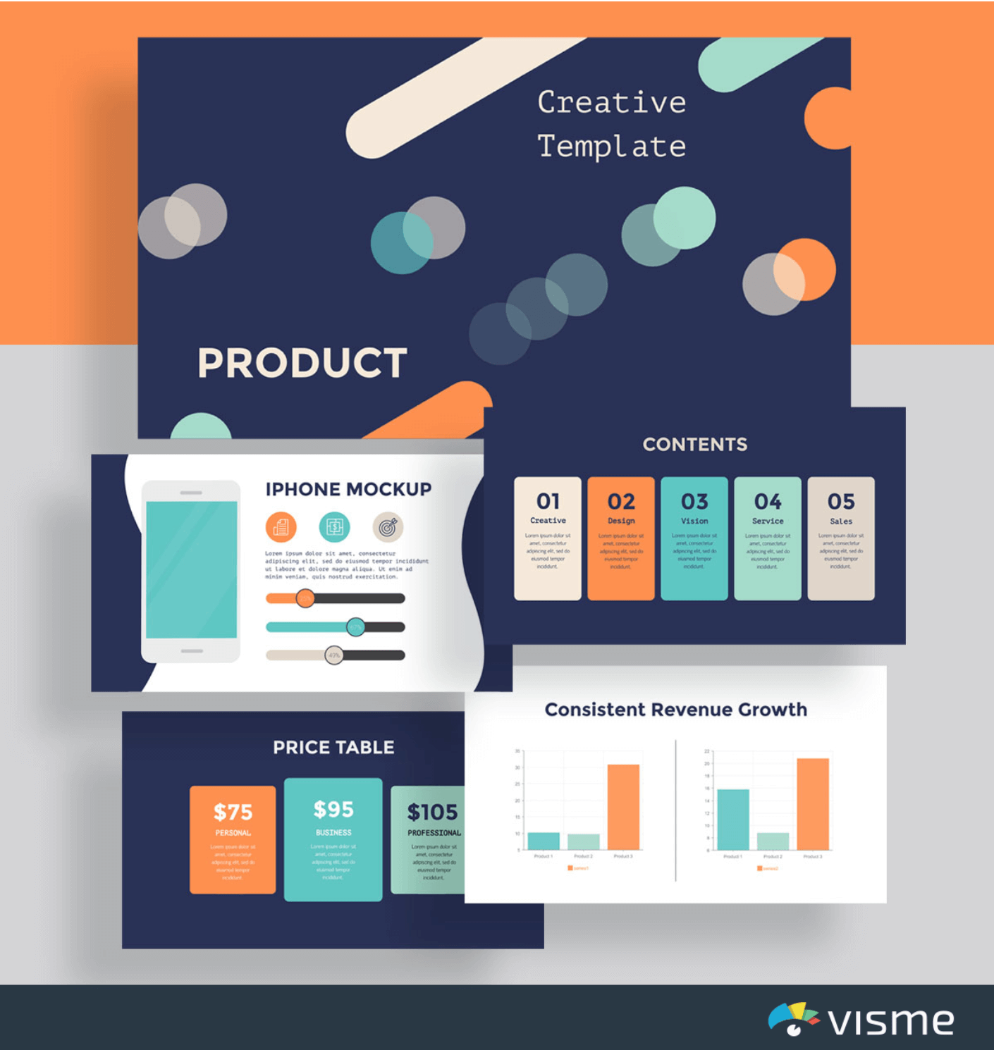
For the times you want to follow a more playful, creative approach, it’d be really fitting to find a template to match the tone of your pitch.
These presentation slides could be an example:
To sum up, in terms of creating a virtual presentation that’ll allow you to present your pitch efficiently and wow your audience, we advise you to find an editable, well made template.
This gives you just the right amount of space and style to present all your points, while giving your audience interesting graphics, data visualizations, etc.
Moving on to the next tip we have for you.
Tip #2: Use the Right Colors
Our second tip is to use the right colors.
This tip is firmly linked to what we discussed just now.
To use the right colors doesn’t just mean that you do successful color combinations that are easy to the eye and create pleasant visuals, although this is important too.
It mostly means that you try to avoid using lots of different colors that might be distracting for your audience.
Trying to fit more than two or three colors into each one of your slides can easily make your presentation look messy.
However, because we’re in love with colors and design, we know that there might be circumstances that you’ll want to use more colors and you’ll need to make it look beautiful.
In this case, our suggestion would be to use a pre-made presentation template as a way of experimenting with colors and getting inspired.
The following template will help illustrate my point:
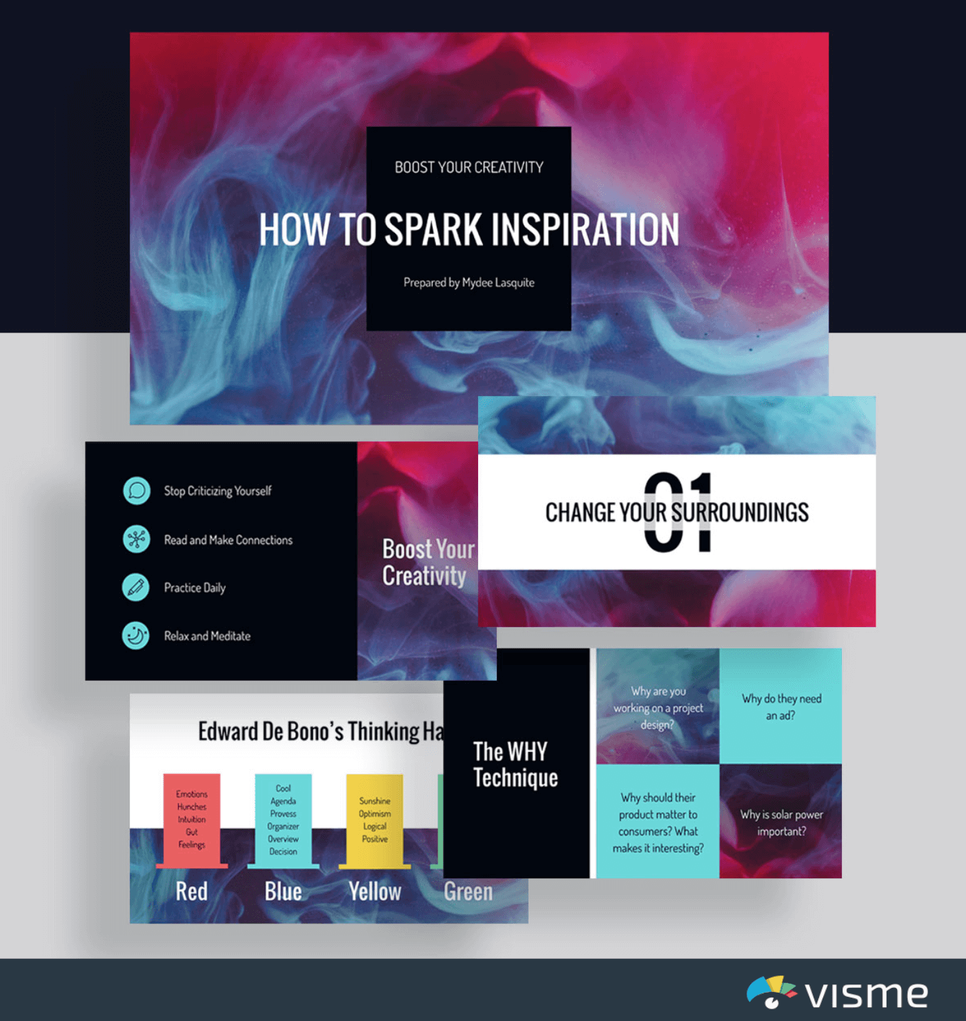
As you can see, there’s more than three colors in the slides shown above.
However, as you’ve probably already noticed, there’s the same colors repeating in almost every one of these slides.
In this case, repetition helps maintain stylistic consistency across all slides which definitely makes it more possible for an audience to remain focused.
Let’s move on to the next tip.
Tip #3: Use a Modern Presentation Tool
The third tip is to use a modern presentation tool.
A modern presentation tool is basically a design tool and presentation software that’ll allow non designers, and designers with tight schedules, to create compelling presentation slides that enhance the power of their pitches.
We’ve already talked about choosing the right presentation theme, as well as using the right colors.
Using a tool that allows you to choose between a wide range of beautiful, ready-made templates can save you both time and money, so make sure you’re keeping this in mind when deciding which tool to use.
On that note, Microsoft’s presentation program PowerPoint might be one of the first to come to mind when thinking about presentations, but today’s fast business pace dictates that professionals use more modern and up-to-date tools and PowerPoint alternatives.
Alongside a wide variety of modern presentation templates, here’s some additional product capabilities you should be looking for:
- Access to graphs and charts that can be used in a presentation
- Access to high quality imagery
- Options to video and audio to your slides
- File sharing that facilitates collaboration for remote teams
- Downloadable presentations so you can present offline if you want to
- Ability to measure how your presentation in doing in terms of views and viewers
And so on and so forth.
In a few words, choose a modern presentation tool that’ll give you the opportunity to benefit from the technology that’s available now, thus making it more possible for you to create a killer presentation.
Additionally, you want to consider the shareability of your virtual presentation. Using a tool that lets you share online with just a link or that creates an embed code is a great way to share your slides with your audience without having to worry about email size limits and the like.
Moving on to our fourth tip.
Tip #4: Make Use of White Space
The fourth tip for designing an engaging virtual presentation is to make use of white space.
In terms of your presentation, white space is any space within your slides that appears to be empty of text and visuals.
However, white space doesn’t mean that you simply leave some points of your slide empty because you couldn’t or didn’t want to find additional visual and textual elements to include.
On the contrary, it should mean that you use those points to your advantage in order to create a structured design.
A structured design will direct your audience’s attention to the most important points of your slides – it could be a quote, an image and/or a chart, etc. – that you wish to bring attention to and highlight.
In other words, using your white space is the best way to point out elements of your presentation that you think are absolutely necessary to make them stand out.
The following image says it all:

Image Source: WhiteSpace Marketing
As you can see, empty space has been used to draw attention to the most important element of the image; the beautiful zebra and the statement right above it.
Let’s see an example that’ll help us explain this point better.
The slide that you see right below comes from B2B SEO agency, MINUTTIA.
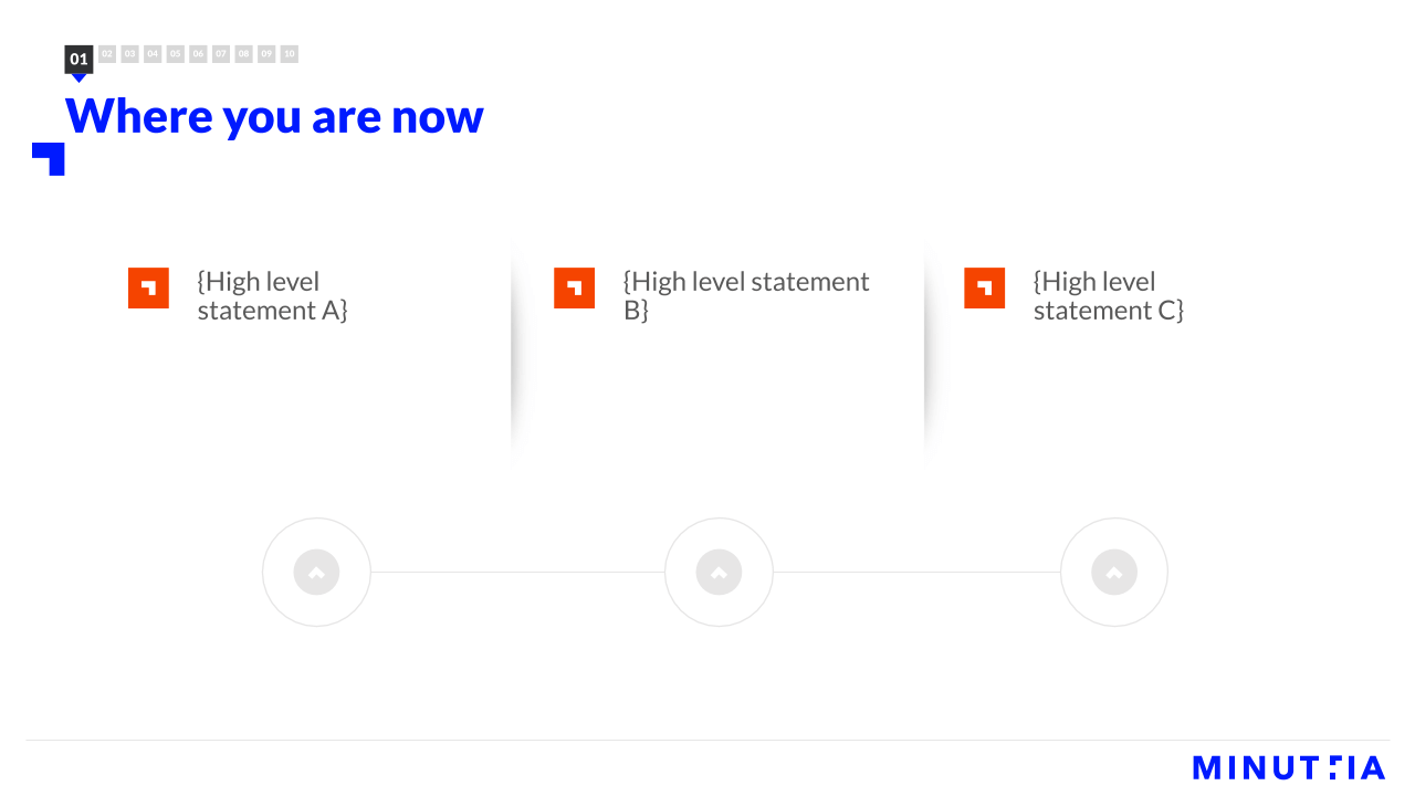
As you can see, there’s lots of white space – which in this case is actually white! – that is used to lead the viewer’s gaze to some of the options that are highlighted with bright colors.
If the page were filled with additional elements and/ or text, the result would probably be cluttered.
A cluttered web page, like a cluttered presentation slide, is very likely to make the viewer feel overwhelmed and distracted.
No one wants that to happen, right?
Simply use the white space across your slides as an extra element that helps you tell your story and highlight all that you think needs to be highlighted through it.
Let’s now move to the next tip.
Tip #5: Keep It Simple
Tip number five is a very important one.
It’s about keeping it simple.
We’ve already discussed some things you could do to make sure your slides don’t look cluttered and won’t make your audience feel overwhelmed or distracted.
Keeping it simple is really about applying all the tips and tricks that’ll help you curate a presentation that’s well structured and helps the viewer not only get the point, but really enjoy the process of listening to your pitch and looking at your slides.
The following example will help frame this beautifully.
Airbnb Pitch Deck
The slides below come from a reproduction of an early pitch deck that American online vacation rental website, Airbnb, did.
Have a look:
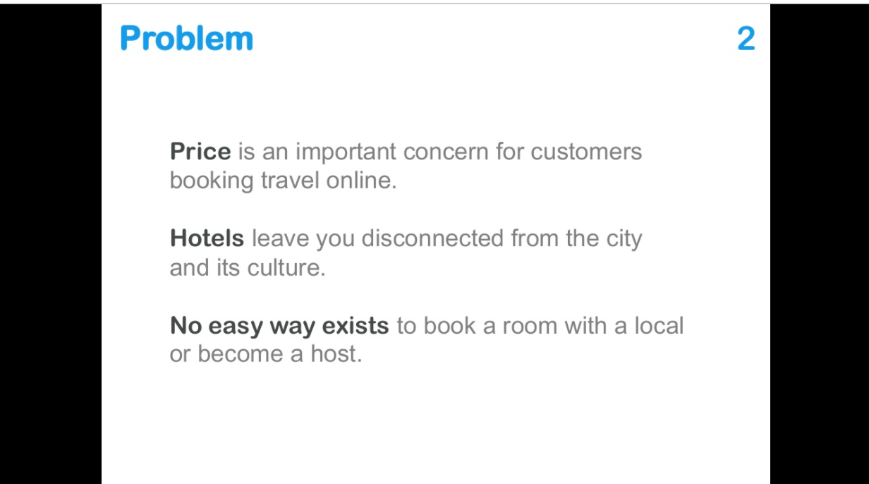
Image Source: Slideshare
Their second slide is a very simple one, with grey and black lettering on a white background.
The slide shown above brings attention to a problem that their product tries to solve.
In presenting the problem, they keep it as simple as is humanly possible.
It works, though, doesn’t it?
The viewer definitely knows where to look.
Here’s another slide for the same presentation.
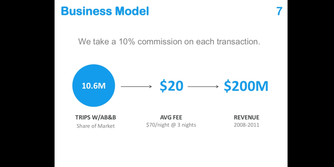
Image Source: Slideshare
The numbers that need to be highlighted are placed in the middle of the slide and are written in blue.
The background is, again, white.
By showing you this, I’m not saying you should do it as simply as Airbnb did in their early years. In fact, you can see how we at Visme recreated the Airbnb and several other real life pitch decks to become more engaging.
You’re free to be imaginative and creative because that’ll make your presentation stand out. Just try to not overdo it and it’ll all go great.
Also, keep in mind that virtual talks and presentations can be overwhelming for some people and you definitely need to do your best to keep them engaged.
On that note, some tips on running virtual events with clients will most likely be of use.
Keep reading to find what the next tip is.
Tip #6: Maintain Brand Identity
The second to last tip we have for you is to maintain brand identity.
To maintain and communicate your unique brand identity across your presentation slides means that you make it explicit – in a subtle way – that this presentation represents your company and it communicates your brand’s values.
Think of your brand identity as the personality of your brand that’s expressed in any way that the company presents its visual identity, approaches and engages with its audience, as well as the overall company attitude in relation to competitors and the industry.
A visually engaging presentation in terms of brand identity is one that successfully incorporates elements of the brand.
An example of this would be to use the company colors alongside the company logo or font.
These are elements that can – and probably should – be included in the presentation one way or another.
Let’s have a look at some slides by the co-founder of LinkedIn Reid Hoffman’s pitch deck for LinkedIn’s Series B fund raising.
Although the presentation is more than fifteen years old – when the platform wasn’t even close to being as successful and popular as it is today – the pitch deck made some elements of the brand identity explicit.
An example of this is the Linkedin logo.
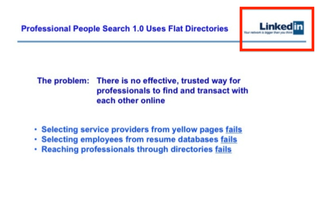
Image Source: Slideshare
The logo is placed on all the slides thus maintaining and promoting brand identity.
Communicating your well developed brand identity is also a way to promote your brand voice and transmit your message more successfully.
Moving on to our last tip.
Tip #7: Tell Stories With Data
The last tip we have for you is one that can truly help you elevate your presentation and make it a success.
That is to tell stories with data.
Put another way, use data visualizations in order to communicate your points to your audience.
Data visualization can be any kind of graphs and charts, such as flow charts, bar charts, circular flow diagrams, interactive maps, infographics, and so on and so forth, that present data in the form of graphics.
There’s great chances that you might be presenting your audience with numbers and stats.
This type of content can be slightly harder to digest if it’s presented in the form of plain numbers explained by text.
An alternative to that is to utilize interesting and well made data visualizations that are easier to read and understand and also help keep your audience engaged.
Here’s an example from marketing platform Moosend, using data visualization in one of their blog posts about creating a marketing plan: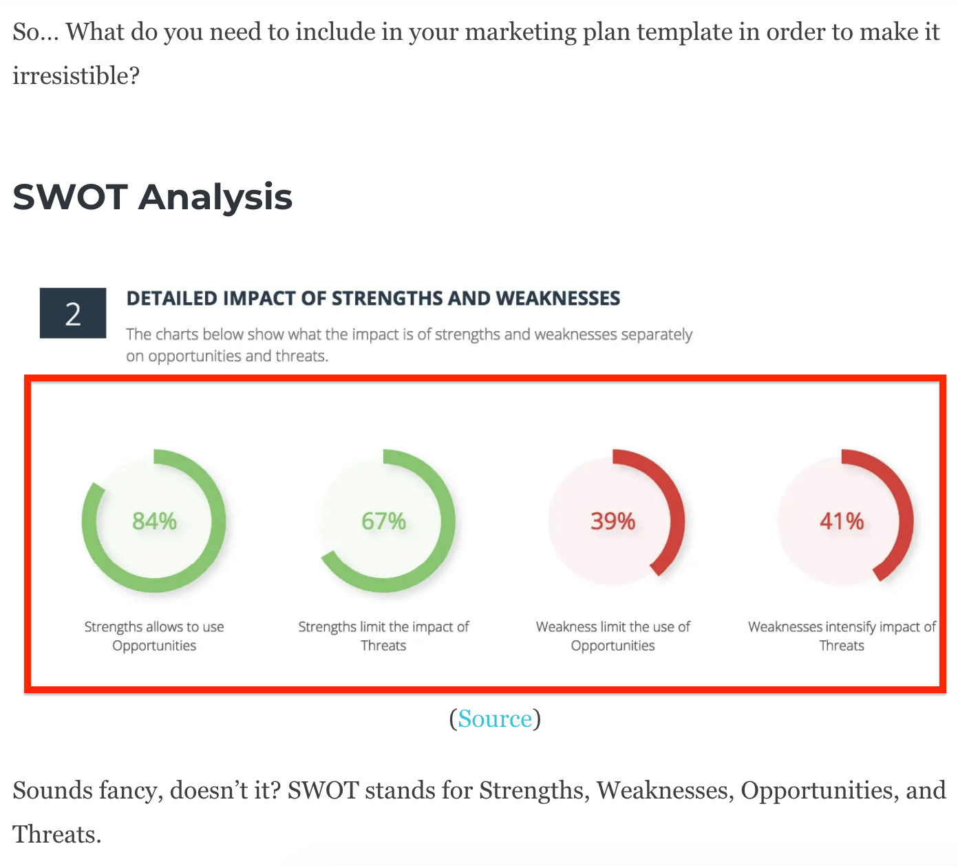
Image Source: Moosend
It helps the reader not only understand the writer’s point, but also become more engaged.
The data visualizations that follow come from a blog post on live streaming stats.
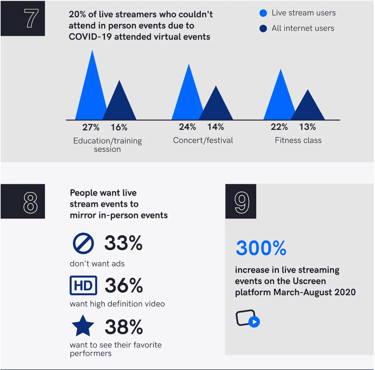
Image Source: Uscreen
Just try to imagine how overwhelming it would be to read a blog post that was explaining all of the data shown above with words.
Whereas now, the content seems well made and it’s easy to read.
Yet another example of data visualization comes from a blog post on how to create a chatbot, which is highly relevant to a large number of people, given the bots seem to be an integral part of the future workplace.
The graph gives insight on the most common reasons why professionals build chatbots.
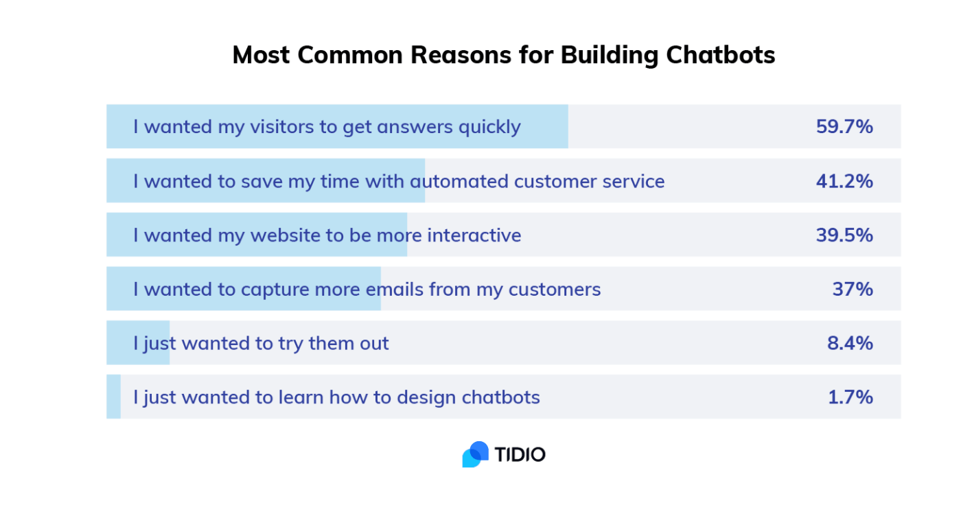
Image Source: Tidio
A final example comes from a blog post by link building software, Respona.
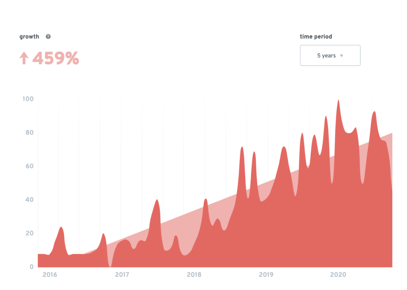
Image Source: Respona
The writer of the piece has used the graph (by ExplodingTopics) to give insight to the reader, thus making the piece more comprehensive and engaging.
The list of companies that use data visualizations is long.
If all these companies are using data visualization to keep their audience engaged, there must be a valid reason, right?
It simply works and it’s pleasant to the eye.
To cut a long story short, data visualizations work well in any kind of format, whether it’s on an Instagram post, a blog post, a homepage, or a presentation deck.
Visualizations help make your presentation slides more engaging and compelling.
Let’s wrap this up with some final thoughts.
Wrapping Up
There you have it.
A list of seven tips that can help you design an engaging virtual presentation and will wow your audience with compelling content.
In this post, we’ve talked about the importance of keeping it simple with the right presentation theme and color scheme.
We’ve also discussed brand identity by checking out examples of real-life businesses and the way they’ve communicated their identity.
My final tip would be to have fun creating your presentation slides.
Use a tool that’ll offer you a wide range of capabilities and make great things with it.
Good luck creating your virtual presentation!