Last updated: March 31, 2025
Two identical events. Same speakers. Same price. Different event webpages. One had 2.3% of page viewers register for the event. The other had 14.8%. What separates high-converting event pages from empty sign-up forms that don’t work?
The difference in conversion rates mostly comes down to following design principles and creating momentum, which is crucial for getting potential attendees eager to sign up on the spot.
In this blog, we break down the organizational and creative aspects of event websites that help conversions based on successful event websites using our website builder, so you can create an event page that naturally guides visitors toward the registration button.
Why Does Having an Event Page Matter?
While there’s still something special about seeing your event advertised on a city billboard or in a glossy magazine, today’s world lives online—on average, 6 hours and 30 minutes every day. Consequently, a digital event page is a must in your event promotion strategies. It works harder than any physical ad ever could, reaching potential attendees 24/7.
No matter how they first hear about your event – billboard, magazine, or word of mouth – people will inevitably turn to Google. And when they land on your event page, those first few seconds are crucial. Ideally, they’re quickly immersed in your event’s story, checking out the agenda and scrolling through speaker bios.
That’s when their mental checklist begins – and your event page answers every question, from ticket prices to parking details. Their initial spark of interest grows into “I can’t miss this.” A few clicks later, they’ve registered, added it to their calendar, and maybe even shared it with friends.
What began as casual browsing transforms into confirmed attendance—all through one seamless digital experience. Such online explorations aren’t just preferred—they’re expected.
What Key Information Should Be Included On an Event Page?
Needless to say, your event registration page is your tireless advocate, working around the clock to showcase why your event matters. Let’s dissect what makes it magnetic.
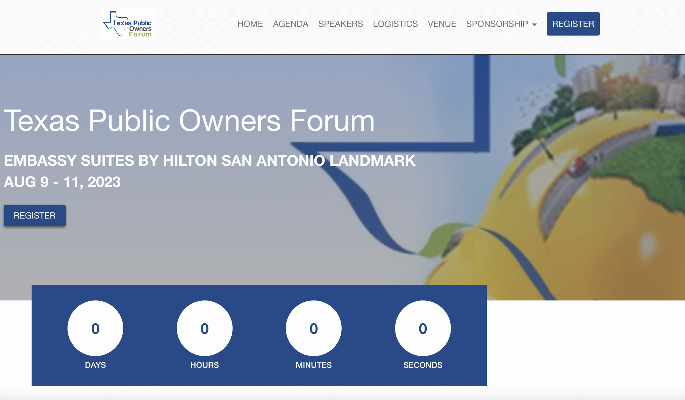
Eye-Catching Event Title and Date
8 out of 10 visitors read webpage headlines, but only two actually scroll down for more. That’s why your headline needs to be attention-grabbing and clearly convey your event’s purpose. It sets the tone for the entire page and must entice visitors to read further.
Display the date prominently – it creates urgency and momentum. Consider adding a countdown timer to reinforce that “don’t miss out” feeling. Lastly, position both headline and date “above the fold” – the portion of your webpage visible without scrolling. This prime real estate is crucial for making a solid first impression.
An example of an event webpage with an eye catching title, date and location we love from Whova:
Detailed Agenda (with Sessions and Timing)
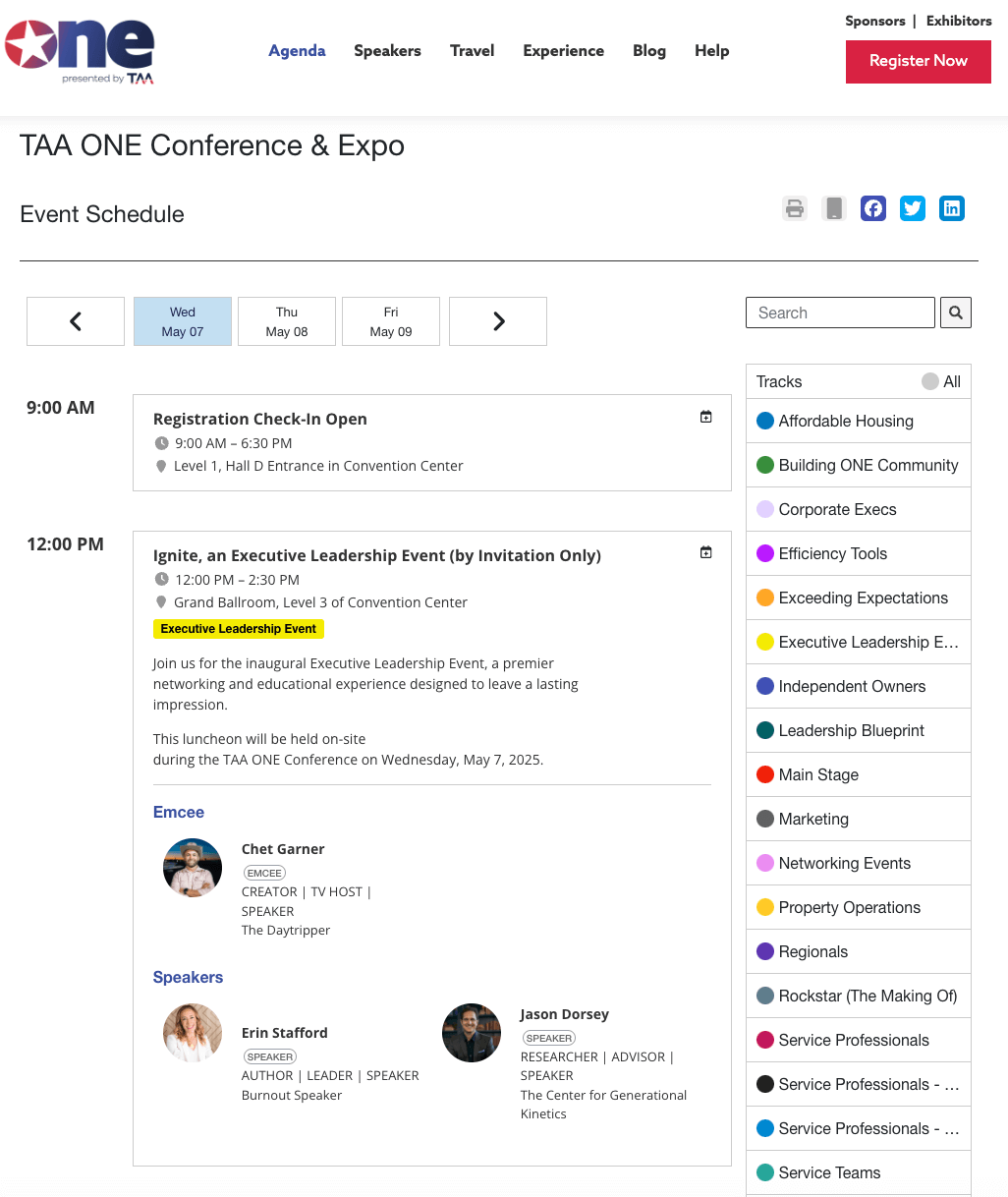
Without a clear agenda showing exactly what attendees will gain, you ask them to commit their time to blind faith – and that’s the fastest way to lose registrations. Break down your schedule into focused segments, include those necessary networking breaks, and ensure every session description answers “What’s in it for me?”
Your agenda should map out a day that feels both valuable and manageable. Include necessary information on your agenda so attendees don’t have to go to a different page to find where their session is or the time. However, make sure your agenda is still simple enough to skim, don’t overload the page with unnecessary information. Make your agenda specific and scannable, and watch your registration numbers climb.
An example of an agenda webpage we love from Whova:
Speaker Bios and Photos
Here’s what people get wrong with speaker bios on event pages: cramming in every career highlight like it’s a LinkedIn profile and writing endless paragraphs no one reads. Did we mention stiff corporate headshots?
What works: Crisp, scannable bios highlighting why this speaker matters to your audience. A mix of impressive stats (“Her strategies have helped startups raise $20M+) with human elements (“Running fuels her best ideas.”) Then add high-quality photos that exude personality – “if the smile doesn’t reach the eyes,” it’s not a good photo.
An example of a speaker webpage we love from Whova:
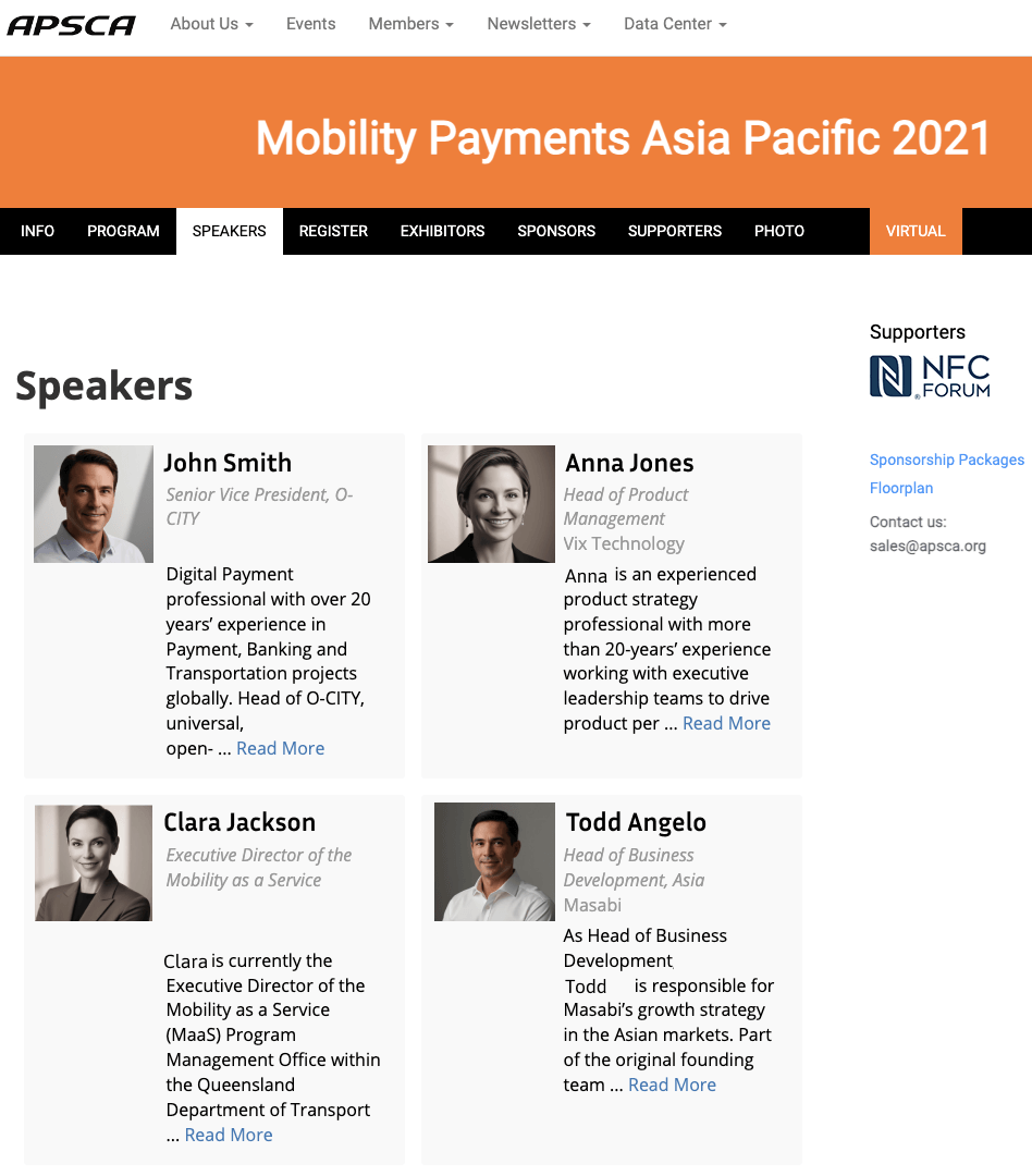
speaker information has been changed for privacy reasons
Prominent Link to Registration Form and Clear Calls to Action
Calls-to-action (CTAs) are your website’s strategic nudges toward registration. Phrases like “Reserve Your Spot,” “Join the Experience,” or “Secure Early Bird Pricing” guide visitors to take action.
After you include some actionable CTAs, create a button underneath that will lead users to your registration form if they click on it. Then your registration form can take over–collecting essential information and handling bookings automatically.
An example of an event webpage with clear registration buttons and actionable CTAs from Whova:
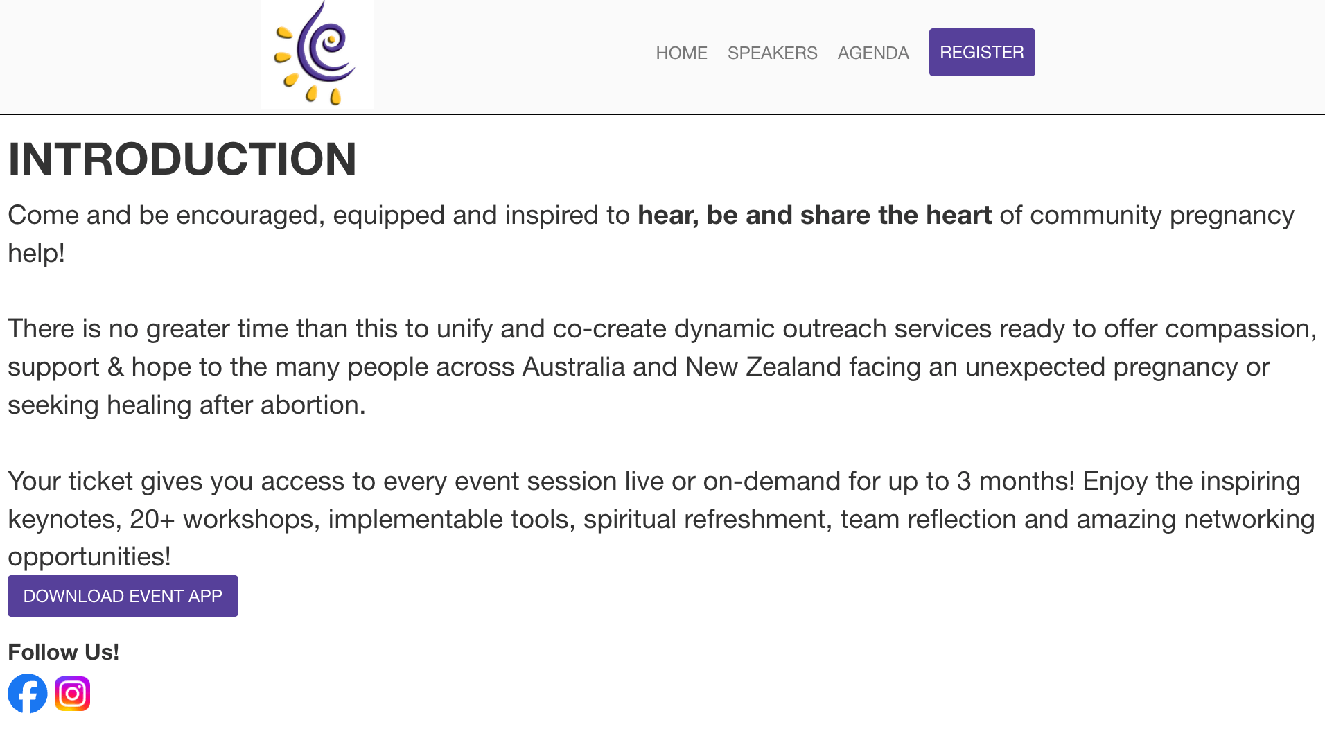
Venue Details (with Map and Directions)
Don’t just provide an address and call it a day. Embed a Google Maps widget to help guests visualize and navigate to your location. Also, spell out directions with street names and landmarks.
Sure, most people will use GPS, but clear written directions will particularly help older attendees who may prefer traditional navigation. Pro tip: Include parking info, too – if people have to pay for parking, they should know.
An example of an event webpage with clear venue details from a Whova customer:
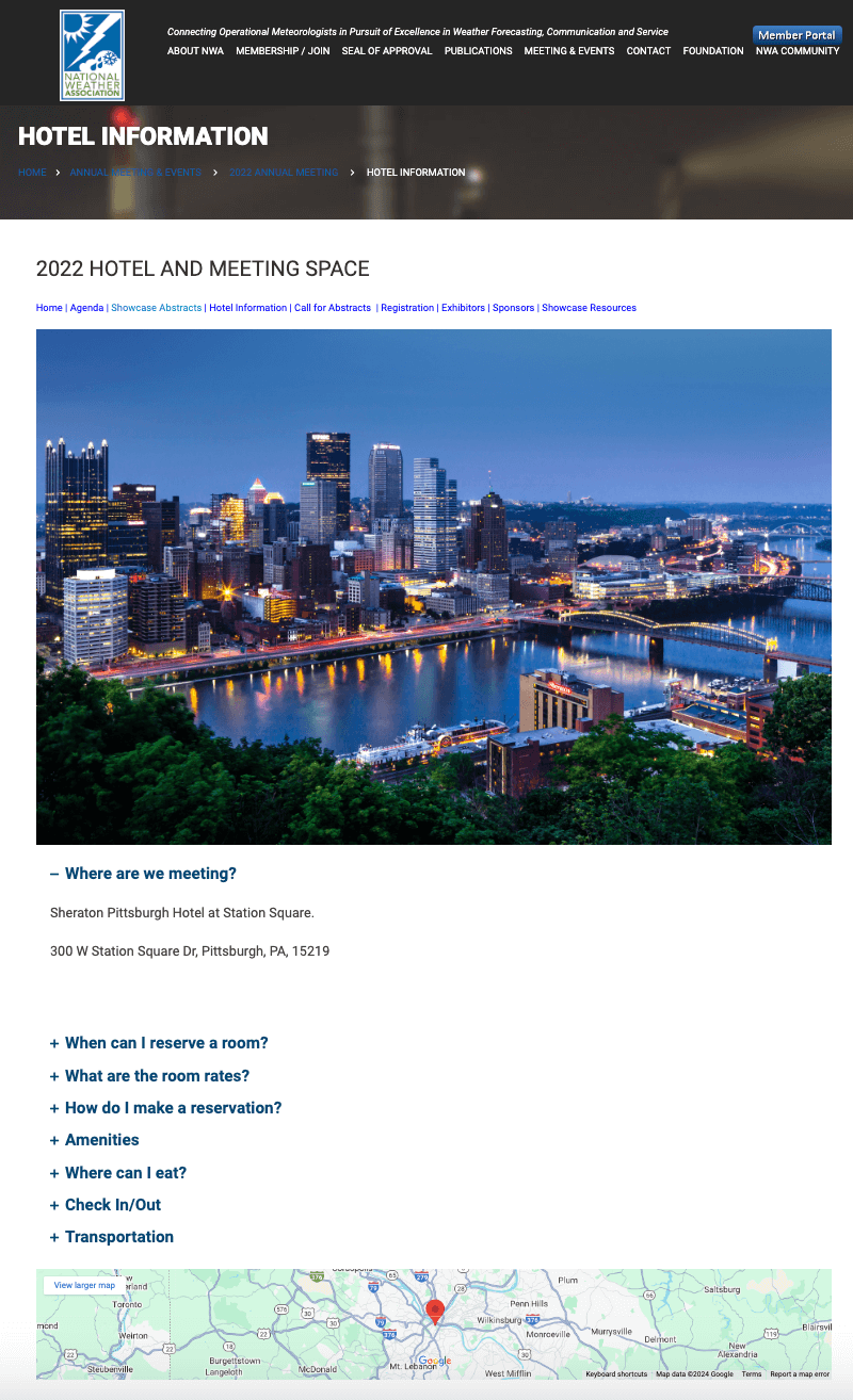
Now that you know about some of the key things to include in your event website, and have also seen how Whova can help you include these elements, let’s get into the step-by-step guide on how to create an event page.
Step-by-Step Guide: How to Create an Event Page
Most event pages focus on the what, not the why. Your attendees aren’t just buying a ticket but investing in an experience – keep this in mind as you plan each step.
Step 1: Choose a Platform or Content Management System
First, you must choose a platform to create your event website that fits your style, budget, and technical comfort zone.
Some of the best event website builders:
- WordPress: Offers incredible customization if you want total control and have time to learn its quirks.
- Wix: A user-friendly contender with drag-and-drop simplicity.
- Squarespace: A design-forward option that makes everything look professional.
- Whova: An all-in-one event platform with fully integrated website builder.
If your event website requires frequent updates, or if you lack coding experience and need to integrate other pages—such as a registration form—into your site, it may be worth considering an event-specific platform that can create your website and manage other event features seamlessly.
For instance, Whova’s website builder creates a fully customizable event website that updates in real time as you make changes to event information. Additionally, Whova’s event management software easily generates other custom key event pages, such as an agenda or speaker webpage, and integrates them smoothly into your main event website.
Step 2: Add Event Information
Generic titles like “Annual Conference 2024” tell potential attendees nothing. Instead, always highlight the value they’ll receive. For example, the “AI Innovation Summit: Transforming Business in 2024” instantly shows why someone should attend.
Lock down the essential logistics. Make the date and time crystal clear, including time zones for virtual or hybrid events. Your venue details should be equally precise – including the full address, nearby landmarks, and parking information.
Step 3: Design the Layout
Time to tackle your event landing page’s visual flow. It’s useful to think of the page’s layout as a story that unfolds as visitors scroll. Start the hero section featuring your event’s headline and key selling points. Then, guide your visitors through a logical journey: what, when, where, why, and how to join.
The design should be clean and scannable, broken up by text and headers, and include:
- Compelling images.
- Strategic pops of color.
- Enough white space to make the information digestible at a glance.
- A “Register Now” button that’s impossible to miss.
- Social sharing buttons to get your audience to share your event with others
Step 4: Include Key Elements (Agenda, Speakers, Registration)
Make sure to display your key sessions prominently. Highlight featured keynote speakers and their achievements to build credibility, with links to the full speaker lineup. Add filters to help attendees find relevant content if you have multiple tracks.
Basically, keep registration simple and smooth. Clear pricing tiers, visible early-bird deadlines, and a straightforward checkout process will maximize sign-ups. Remember, every extra click risks losing a potential attendee.
Step 5: Add a Clear CTA
The simple rule of Internet marketing is that event web pages should direct readers to take action. To achieve this, place your primary call-to-action visible before scrolling. For longer pages, add a floating registration button that follows visitors down.
Aim to create natural urgency; “20 early-bird tickets left” or “workshop limited to 15 people” motivates action without feeling pushy. Psychologically, clear constraints like “10 people max” create a simple “now or never” choice in people’s minds rather than an open-ended “maybe later.”
Best Practices for Optimizing Your Event Page
Got your event page set up? Great! Now, you need to ensure people find it (and love it when they do). While search engine optimization and keywords might sound boring, they make you reach the top of search results.
SEO for Event Pages
SEO is a prerequisite to boosting your online presence. Focus on these things if you want to drive traffic to your event page:
- Words people might type to find your event (like “AI conference Seattle” or “craft fair Portland”) – these are your keywords, and you’ll need to implement them in three crucial places: your page title, the meta description (the preview text in Google), and your headings.
- Use relevant keywords to add descriptive alt-text to your event images. This helps search engines understand your content while making your page accessible to everyone, including those using screen readers.
- Create a simple URL structure that includes your event name and keywords (like “yoursite.com/summer-festival-2024”). Avoid messy URLs with random numbers and symbols.
- Include all the basic event info (date, time, location, price) on your page – this is good for visitors and helps Google understand your event details.
- Create clear sections with headings like “Event Schedule” or “How to Get Here.” Use your keywords naturally in some of these headings.
A tip: If your keywords sound weird when you read them out loud, you’ve probably added too many. Write for people first, search engines second. The three most important technical factors are your keyword placement, image alt text, and page speed. Get these right, and you’re halfway there.
Mobile Optimization
Mobile optimization doesn’t make your page “kind of work” on phones—it creates a natural experience on smaller screens.
Most people will seek out your event details on their phones. So, if your event web page isn’t optimized for mobile, it will be harder for them to engage. In other words, the process will be too cumbersome and chase them away.
An important aspect to consider is thumb-friendly design. This is where people’s thumbs naturally rest when holding their phones. Your “Buy Ticket” or “Register Now” buttons need to be where they are easiest to tap (the bottom half of the screen is prime real estate for this!)
Font size also matters more than you might think. Tiny text that looks fine on a desktop may not be legible on mobile devices. As a rule of thumb, 16px is a good size for everyone to read your event details without zooming in or out.
Engaging Visuals and Videos
First, let’s address the elephant in the room: page speed. Did you know that a mere 2-second delay in loading time can double your bounce rate? Half your potential ticket buyers will disappear before seeing your amazing event details. (Check yours with Pingdom and PageSpeed Insights)
When it comes to images, think of them like packing for a trip – you want all the essentials, but nobody wants to carry a heavy suitcase. Compress your images using tools like TinyPNG or ImageOptim to reduce file sizes without sacrificing quality. Your goal is for images to look crisp but load quickly.
Now, video content is booming! People are 85% more likely to buy tickets after watching an event video. But there’s a smart way to handle it so it doesn’t slow loading speed: Use a video platform like YouTube or Vimeo to host your videos, then embed them on your page. This saves bandwidth and provides better playback quality.
Pro tips for your event visuals:
- Use a mix of photos from past events
- Include short teaser videos (30-60 seconds max)
- Show authentic moments rather than just staged shots
- Add captions to videos (many people watch without sound!)
Visual content tells your event’s story, but it shouldn’t insist visitors wait around while it loads!
Some event management systems have software features that can make a website for you that includes these optimization tactics automatically. For example, learn more about Whova’s customizable webpages:
Common Mistakes to Avoid When Creating an Event Page
We’ve all been there – rushing to get that event page up while juggling a million other tasks. However, too many great events risk poor attendance because of simple, fixable mistakes on their landing pages.
Overloading the Page With Information
Have you ever walked into a cluttered room and felt instantly overwhelmed? That’s how visitors feel when they land on an event page stuffed with endless details.
Use expandable sections or tabs for secondary information, such as detailed FAQs, complete schedules, speaker bios, or venue floor plans. This lets interested visitors dive deeper without overwhelming casual browsers.
The most important details are immediately accessible, with more specific information just a click away. Before adding any content, ask yourself, “Would a first-time visitor need this information to make a ticket-buying decision?” If the answer is no, consider moving it to a secondary page or expandable section.
Your goal isn’t to showcase every detail about your event but to guide visitors confidently toward that “Buy Tickets” button. Every word on your page should earn its place.
Using Weak CTAs or Not Having Clear Action Points
Steer clear of the “Click Here” or “Learn More” buttons. Nobody has ever gotten excited about clicking “Submit,” right? Rather, use action-packed, specific phrases that create urgency and excitement: “Secure Your Early Bird Tickets,” “Save Your Spot,” or “Join the Festival.”
Strategic placement is everything. Start with a bold CTA near the top of your page for those ready-to-buy visitors (you know, the ones who don’t need much convincing). Then, sprinkle additional CTAs throughout your page after key selling points.
Just finished describing your amazing headline act? Drop a “Reserve Front Row Seats” button right there. Detailed your VIP perks? Follow it with “Upgrade to VIP Access.”
Neglecting Mobile Optimization
We touched on mobile optimization earlier, but we must re-emphasize its importance. In addition to response design, you also need to consider contextual awareness. For instance, mobile users accessing your event page during weekday evenings are often in “browse mode,” while weekend mobile traffic shows significantly higher purchase intent.
Adapting your call-to-action prominence and content hierarchy based on these temporal patterns could dramatically improve conversion rates during these high-intent windows. And there’s something else rarely discussed: the “second screen syndrome” in mobile ticket buying.
Over 95% of mobile users are simultaneously watching TV or streaming content while browsing events. This split attention economy means your mobile experience needs to be resilient to interruption – think auto-saving draft orders, persistent shopping carts, and intelligent session recovery.
Event organizers still treat mobile sessions as linear journeys when, in reality, they’re more like a series of scattered micro-interactions that eventually culminate in a ticket sale. Keep this in mind when you build an event website.
Bonus Section- How to Use AI to Simplify the Process of Creating an Event Page
A lot of work goes into creating an event page, and the task of writing or organizing all the webpage content from scratch can seem daunting. The AI industry has exploded in popularity over the past few years, leading to release of helpful AI tools that can make creating an event page easier. AI can help event organizers create engaging and informative content for an event page by quickly generating compelling descriptions, headlines, and key details that resonate with the target audience. It can suggest engaging copy for event overviews, speaker bios, session descriptions, and ticketing information based on the event’s goals and theme. AI can also ensure the content is optimized for clarity, SEO, and audience appeal. Example prompts an organizer might use include: “Write a captivating event page description for a wellness retreat focused on mindfulness and stress relief,” or “Create a speaker bio section for a tech conference highlighting an expert in AI and machine learning.” This allows organizers to focus on other aspects of the event while maintaining high-quality content on their event page.
Learn more about how AI can help your event planning.
How to Build an Event Page Today
We’ve covered a lot of ground here – from decluttering your content like a spotless exhibitor booth to making your mobile experience smoother than elevator jazz. At the end of the day, you’re creating a story that sells tickets via a digital web page.
Remember our key ingredients? Keep your essential information front and center, let your visuals do the heavy lifting, and treat your mobile experience like a VIP. You might think, “This sounds great on paper, but I’ve got 47 other tasks on my event planning plate, and website design isn’t in my wheelhouse.”
Not to worry. Whova automatically generates a customizable event website that ensures your event page hits all the marks we’ve discussed without you having to memorize a single line of code.
Moreover, your event details evolve, new speakers are confirmed, sessions get updated, and your page updates automatically. Plus, it merges with our other event management features like ticketing, exhibitor management, and more.


